""

SAP BusinessObjects Dashboards

SAP BusinessObjects Dashboards 4.0 Cookbook - Review

IntroductionSAP BusinessObjects Dashboards 4.0 Cookbook, by Xavier Hacking and David Lai (352 pages, May 2011) promises you nothing less than "Over 90 simple and incredibly effective recipes for transforming your business data into exciting dashboards". Does it achieve this objective? Read the full review below to find out.

While I have experience working with BO Xcelsius 2008 (what BO Dashboards would formerly go by), I didn't have any with BO Dashboards 4.0 before reading this book. So my expectations about it were simple: tell me how to do with BO Dashboards 4.0 what I already know how to do with Xcelsius; give me recipes around the new features, and show me a few extra tips. I can tell you right now: even though this book has not met all my expectations (as it's not focused on the new 4.0 version), it is a really good one.

The book is structured in ten chapters (see the table of contents) containing a dozen recipes each. The recipes follow a steady progression, from simple to advanced recipes. You can of course directly jump to any recipe, but reading the whole book in the proposed order is also a possibility.

SAP BusinessObjects Dashboards 4.0

The good and the bad

In a few key points I would like to offer my perspective on the strengths and weaknesses of this read, what I found to be particularly stimulating and enriching as well as on some aspects that I, as a reader, would've liked to see integrated.

What I like the most:

  • It feels like the recipes come from a real-life experience. Not only do the authors tell you how a component can be used, but they also tell you in which circumstances these are used at their best. The examples used by the authors make a lot of sense.

  • The recipes chosen cover a nice proportion of the BO Dashboards / Xcelsius universe. It is a very good base from which to start and move forward.

  • The first chapter is about best practices (color-code and comment the spreadsheet, etc.); strictly speaking not recipes but the fact remains that this is still a very good idea.

  • The chapter about add-ons shows in an easy way how to extend BO Dashboards.

  • The links to online resources are few but worth it (one of these is, for example, the very useful Business Objects Board).

  • The book is quite clear and well written. Examples are easy to follow thanks to full color illustrations.

What I don't like:

  • A few things aren’t outlined with enough precision and may need some time in research before executing.

  • The index is cluttered with many terms that I wouldn't describe as necessary (to take an example, all the supported Excel functions are listed, and I doubt that anyone will look for the entry entitled "dashboard" when that is what the whole book is about).

  • Some of the internet links given in the book cannot be reached as of today.

What I'm missing:

  • I would have enjoyed is a section about the differences between Xcelsius 2008 and Dashboards 4.0 with a list of recipes that are valid only on the latter. It would allow experienced users to focus on the new features only (rather than having to flick through all of the recipes). This is where the book tends to fall short, in my opinion.

  • For intermediate readers, a more complete real-life dashboard example could have been a great addition. The two case studies provided in the appendix A are good, but still pretty far from what I've been asked for in most client engagements.

A book for whom?

While many cookbooks require a good knowledge of the corresponding software/programming language, this is not the case here. The initial part of this book is targeted at beginners and no prior experience of BO Dashboards (or former Xcelsius versions) is required. Some general knowledge of Excel is required but some recipes deliver useful tips about it.

So if you're new to BO Dashboards; do you want to buy this book? Definitely. You will get much farther (and much more quickly) with this book than with only online tutorials and the official documentation. The recipes are really clear and can be used for real-life dashboards.

Note that it's also a perfect book for Xcelsius 2008 beginners – you'll be able to use more than 90% of the book's recipes, and many of the example files can be opened in it.

Do you have previous experience with Xcelsius? Although many of the recipes might probably not be that exciting to you, you're still likely to like some of the recipes. Having a look at the table of contents shall be enough to convince you to buy this book (or to leave it aside).

If you're expecting a book on BO Dashboards 4.0, bear in mind that only a few recipes are specific to this version.

Conclusion

Although the title is a slightly misleading, the SAP BusinessObjects Dashboards 4.0 Cookbook is a great book to help any dashboard developer to improve on his/her Dashboards 4.0 / Xcelsius knowledge. Don’t miss it!

Thanks a lot to Pakt Publishing for sending us an e-copy of the book for the review.

PS: note that I only had access to the e-book version, so I can't say anything about this full-of-paper book you'll buy in a bookshop.

Loading Status Animation in Xcelsius

Often when developing a dashboard with Xcelsius we have connections to a DataBase, either with LiveOffice or QaaWS (Query as a Web Service). This leaves us with only two options to refresh our dashboard: either we proceed once all the Xcelsius components are loaded or, alternatively, change a radio button, combo box or any of the components related to the connection objects. In both these examples, when having to manage large amounts of data, we would normally wait until the connection returns our request. This can be frustrating, especially when we don’t have any indicator to signal that the data is being processed. In this article I will illustrate a convenient solution to this problem.

  • First of all we need to create the objects that will be displayed while the query is loading the data: I would advise to start by creating a rectangle as a fake layer. Once this has been done we create another image that will be our animation.

We have many possible animations:

View the flash file: Loading Animations in Xcelsius

This is how the animation appears:

View the flash file: Xcelsius Animation

  • We then group these two objects and bring them to the front.

  • In a spreadsheet we create a cell where we bind the status of the query.

  • Reached this point, under properties in QaaWs or in Live Office connection we follow these steps:

In the Usage tab:

Load Status section:

  1. In the Loading Message cell we hardcode a "L"
  2. In the Idle Message cell we hardcode a "C"
  3. In the Insert In option we should map the cell of the spreadsheet, in our case "B1"

  • Finally we select the group that we had previously created, and in the dynamic visibility window we map the Status to the "B1" cell and the key to an "L". This means that while the query is loading, we can simultaneously view the group.

The final result is as displayed below.

This strategy contributes to providing a user friendly environment in particular in those situations of slow data retrieval.

If you have any questions or suggestions about this solution, please feel free to leave a comment and I will gladly reply.

SAP BusinessObjects: Through the Eyes of Critics and Clients

In our day-to-day life we are exposed to many purchasing decisions. Going to the supermarket to get some food or buying widgets in an internet shop is no longer a quick and easy task. The diversification of vendors forces us to go through a conscious or unconscious decision making process. It is always interesting to study the reasoning that leads to an action, especially for marketing people, and it is a social phenomenon in constant evolution, ranging from the traditional word of mouth to the most modern surfing of internet forums.

The same happens when a company has the opportunity to make a BI investment and has to choose a vendor that fulfills their particular needs. There are some specialized consulting companies that carry out complex market studies, but the feedback received from clients or contacts is just as influential to the decision making process.

This blog article is focused on the latest studies from Gartner and Forrester regarding SAP BusinessObjects.

The Forrester Wave: Enterprise Business Intelligence Platforms, released during the last quarter of 2010, considers SAP BusinessObjects to be leading the market together with IBM Cognos, Oracle and Information Builders, followed by SAS, Microsoft and MicroStrategy close behind. The 145 criteria used correspond to vendor surveys, product demos and customer reference surveys.  The end result is a graph that situates BI vendors in relation to their current offering and strategy.

SAP BusinessObjects is recognized as having very good BI tools for each job:

  • Crystal Reports as top report writer embedded in thousands of applications;

  • Explorer as a combination of the power of OLAP and the simplicity of search, exploration and analysis;

  • SAP BusinessObjects Dashboards is very popular amongst executives that can visualize the generated flash in disconnected mode and no SAP software installed;

  • BEx being still the most widely used and popular query and analysis tool for SAP BW users;

  • Business Warehouse Accelerator with the speed of in-memory database to provide a powerful DBMS optimized for BI;

  • SAP is also leading in self-service BI software as a service (SaaS) offerings.

According to Forrester, the downside of having all these tools is a poor product integration and a lack of object reuse from product to product, which is supposed to be improved with the new release BI 4.0 in Q1 2011.

Gartner’s Magic Quadrant for Business Intelligence Platforms, released in January 2011, considers the same leader vendors as Forrester and also adds QlikTech thanks to its recent continued growth. It uses standard criteria divided into two categories: completeness of vision and ability to execute. According to the study, a good strength is to have the largest share of the BI platform market (combination of SAP NetWeaver BW and SAP BusinessObjects) with an installed base over 46,000 customers and one of the largest channel and services ecosystems. Reporting and ad-hoc querying capabilities were rated high by customers, whereas other SAP NetWeaver BW tools were below the market average. However, in regards to OLAP, BEx Analyzer seems to be more widely used than Voyager. The complements to the BI platform are also seen as positive: collaboration and decision support (StreamWork), Text Analysis, search-based data exploration with its Explorer product, and the enterprise information management products with data integration, lineage & impact analysis, and data quality. The vision for an in-memory appliance, HANA, promises to solve many of the perennial performance issues of large complex BI deployments in general (given its SQL and MDX access for third-party BI tools) and SAP BW in particular. As also reported by Forrester, SAP has been one of the first of the leading BI vendors to introduce a SaaS offering, BusinessObjects OnDemand BI. In addition, SAP has also made investments in mobile BI with its Sybase acquisition and the SAP BusinessObjects Explorer iPhone/iPad application.

In the cautions part of the report, Gartner mentions some concerns that customers have about the roadmap after product changes to support optimizations with the SAP Business Applications and NetWeaver BW products, and also a perceived higher cost of ownership. Migration, implementation and integration choices are reported to be confusing by some customers. Finally, ratings for support, software quality and sales experience are unfortunately low compared to other vendors in the survey. This is currently being address by SAP; they are giving more and more importance to Channel Partners like Clariba, which can provide high quality uninterrupted support, much more aligned to the customer needs.

If you have any questions or comments about the Gartner or Forrester summaries mentioned in this article, or would like more information about Clariba’s SAP BusinessObjects services, please leave a comment below or contact us at info@clariba.com.

Xcelsius - Finding the Location of a Click

While developing an Xcelsius dashboard for a Clariba customer, I came across two interesting challenges related to the location of a click on drillable charts.

Finding the location of a click on a drillable chart – Part 1

I was working with a drillable chart with two series and I wanted to know where the user had clicked (i.e. which series and which position).

With only one series there wouldn't be any problem. Xcelsius can send the selected series to a cell, and the selected position to another cell. But with more than one series, each series can still send a position, but Xcelsius does not allow all the series to send the information to the same place. So the information has to be sent to different places. As a result, it's hard for the developer to know which point was clicked last, as the information sent before is not deleted.

Solution The idea is to use the series name in a VLOOKUP function to find out which position was sent last.

For the details, I have used the attached Xcelsius file:

As Xcelsius forces us to send the information from the different series to different places, let's do it.

In the attached file, I sent the positions to two different places (Drill!B2 for section 1, Drill!B3 for section 2). But how did I know which value was sent last? I simply used the series name. I have configured the chart to send the series name to Drill!B5, and I use a VLOOKUP function to find the relevant position (see the formula in cell Results!B4). I can then use this position to find the label (or any other relevant information) with the OFFSET function (cell Results!B1).

Finding the location of a click on two drillable charts  – Part 2

In the second scenario, I had two drillable charts with the same horizontal axes and the same series. I wanted to know where the user had clicked (i.e. which graph and which point - series and position)

With Xcelsius it is not possible to send the name of the clicked graph somewhere. Each series can send a position (or value, row or column), but Xcelsius does not allow all the series to send the information to the same place. This is the same challenge as Part 1 in that the information has to be sent to different places. As a result, the developer doesn’t know which point was clicked last, as the information sent before is not deleted.

Solution The idea is to send rows with position and graph name (instead of sending only the position), and to use the series name in a VLOOKUP function to find out which row was sent last.

For the details of the solution I have used the attached Xcelsius file:

When the user cliced on a dot in a chart, I wanted the graph to send 2 pieces of data: the graph name and the position (in the horizontal axis). Instead of sending only the value or the position, I configured the charts to send a row (columns also work). The sent row had the two pieces of data in it. In the example file I configured the quantity chart to send the data from Drill!E2:F3, and the value chart to send the data from Drill!E5:F6.

When the first series is clicked, the data is sent to Drill!B2:C2; the second series is sent to Drill!B3:C3.

So now we have the chart names in Drill!B2:B3 and the positions in Drill!C2:C3. But how do we know which row was clicked last? For this we use the series name. I configured each chart to send the series name to Drill!B5. Now, if I click in the chart Quantity, on the dot Section 2 / Month 2, then "Section 2" will be sent to Drill!B5, and Drill!E3:F3 will be sent to Drill!B3:C3.

Then I simply put the information together. I found the chart name with a VLOOKUP function on the series name (formula in cell Results!B1), the position with another VLOOKUP (cell Results!B5), and the month with an OFFSET on the position (cell Results!B2).

This has been a quick look at the ways to find the location of a click on drillable charts… I would be interested to hear if anyone else has found a solution for similar challenges. If you have any feedback or ideas, please feel free to leave a comment below.

Loading Message Solution for Xcelsius

One of the most challenging issues that Xcelsius developers face everyday is related to the performance of dashboards. Sometimes performance can be improved by changing the connection properties, changing the queries, reducing the Xcelsius components or reducing the formulas within the Excel sheet that populates the dashboard.

However even after making these adjustments, it’s possible that the dashboard may still take longer than expected to load. In fact, the calculation of some critical formulas such as SUMIF or VLOOKUP can take several seconds to update the values. But rather than explaining to users that the dashboard is locally calculating the values and that they simply have to wait for a short while, why not show them the loading progress in action…

What I have created is an “enable” button for our filters that will show the loading message for a defined period of time before showing the data. Please note that this is meant for Excel triggering and not for queries (even if it can be easily adapted by using some of the outputs as triggers for the data connections).

The components I used are as follows:

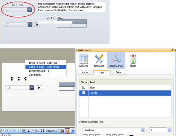
  • Combobox 1: This is filtering only the labels and sending the selected one to a destination (using filtered rows settings).
  • Combobox 2 (behind 1): This filters the entire table only when the play button sends values greater than 0 (so it is in PLAY mode) and less than our max time (in this case 6 seconds). It uses filtered rows and sends the output to a destination. Note: it filters the value 1 from the column with a formula that says: IF what I selected from combobox 1 is equal to what I see in the related column of my source table, then 1 else 0.
  • Spreadsheet Table: I needed an output control to show the values, but of course in real life this could be any other component.
  • Play control: This manages both our loading message and the combobox 2. It has the auto rewind option enabled but neither the auto play nor the auto replay. We should calculate the time that we need to show our loading message and set the play control to that value (or that value +1. it depends on the logic you want to use).
  • Background: This is meant to create the real loading effect that thanks to the “Block mouse events” option avoids any inappropriate clicks of our users while the dashboard is thinking.
  • Text label: This says “Loading…” but could say something else. The important thing is that the user needs to understand that the dashboard is calculating the values.
  • Horizontal progress bar: I used this control that shows the output values of the play button to have more loading effect.

Note: the last three components have been chosen within the out of the box ones to keep things simple. In a real case I would use some flash animations or the loading component that has been released by Donald MacCormick within the xcomponents solution.

The formula I used to show the loading message (and enable combobox 2 as already explained) says the following: IF the output value of the play control is greater then 0 and less than the maximum I need, then 1 else 0.

I hope you find this solution helpful and easy to implement. Feel free to check out the SWF file to see an example of how the loading message solution works and download the test XLF in the zip file below. Let me know if you have any questions or comments.

SWF file: loading message_solution

XLF file: test_v3

SAP BusinessObjects Dashboards running on Android

While Apple and Blackberry users struggle to find ways to visualize the latest versions of flash content with their devices through several applications and plug-ins, Google with its open source philosophy, seems to be in first position in this race.

The latest release of Android, v2.2 (“Froyo”) based on Linux Kernel 2.6.32, natively supports the Adobe flash technology used by SAP BusinessObjects Dashboards (formerly Xcelsius) and SAP BusinessObjects Explorer. The difference is that it allows for the interactive visualization of Dashboards, WebIntelligence reports and exploration spaces without the need for a third-party application, unlike iPhone, iPad and Blackberry.

This means that your company can leverage the effort spent building Xcelsius dashboards by providing mobile employees with a very powerful and interactive interface to make business decisions in the field. It is clear that not all dashboards would be suitable for mobiles and screen dimensions should be taken into account when developing, however below you will see an example which was not specifically designed for mobile but actually fits perfectly in my HTC Legend.

Dashboards on Android

Adobe announced officially on October 25, 2010 that Google's Android OS 2.2 already includes the Flash Player 10.1 plug-in as well as the brand new HP Palm Pre 2, but did not say yet when it will release the versions for the BlackBerry OS, Microsoft's Windows Phone, the Symbian OS, or Nokia/Intel's MeeGo.

Apple has insisted that iOS-based devices like the iPhone and iPod touch will never offer a Flash player. Instead, the company is looking in another direction, surprisingly towards an open standard this time: HTML5.

Finally, on the BI vendor side, it is also interesting to note that as a result of an increasing demand for BI content in Apple devices, SAP BusinessObjects, which used to endorse an application called Roambi Mobile Dashboards by MeLLmo, Inc., is currently developing its own solution for an interactive BI experience which we will certainly have to keep an eye on.

If you have any comments about developing dashboards for mobile devices, feel free to leave a note below.

Tips for Installing Xcelsius 2008 with Office 2010

While Microsoft Office 2010 has been available for retail since June 2010, the latest version of Xcelsius (2008 SP3 FP3.3) is not yet officially supported. At the moment you are supposed to run it with Office 2003, XP or 2007. But you may be interested to know what happens if you try to install Xcelsius 2008 on a computer which "only" has Office 2010…

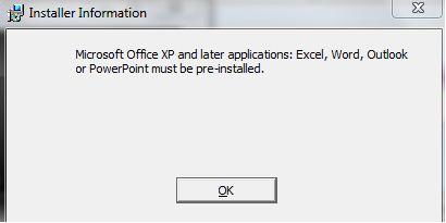
To begin with, you get the following message:

Microsoft Installer Information

In reality, Xcelsius 2008 will work fine with Office 2010. The only question is, how do you get rid of this installation problem? A possible workaround is to install an earlier version of Excel, install Xcelsius, then remove the older Excel. But it takes time, and you probably don’t have any installer file for an earlier version of Office.

The purpose of this post is therefore to allow to you to perform the installation of Xcelsius 2008 with Office 2010 in a quick and efficient way. The principle of the workaround is to prevent the installer from checking the presence of Office on the computer by tweaking it.

Prerequisites:

  • An Xcelsius installer file. For this article I’ve downloaded the file xcelsiusent2008sp3.exe from SAP Business Objects Software Downloads.
  • A license key available on service.sap.com/support – Keys & Requests
  • InstEd, a free MSI editor
  • A software able to extract data from zip-formatted files. 7zip works fine and is free – also for commercial use.

Steps:

Extract to Xcelsius
Extract to Xcelsius
  1. The Xcelsius installer file is a zip archive. Extract the data from it.
  2. Download the latest version of InstEd and install it on your computer.
  3. Make a backup of the "Xcelsius.msi" file located in the "package" folder. If you make any mistake with the msi file you'll be able to recover it.
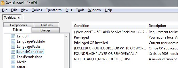
  4. Open with InstEd the" Xcelsius.msi" file. On the left part of the screen, in the "Tables" tab, click on "LaunchCondition". On the right side you’ll see a list of conditions that are checked.
  5. Delete the row which refers to Office (it begins with "(EXCELl10 OR OUTLOOK10") and save the file.
  6. Now execute the "Xcelsius.msi" file you’ve just modified. You shouldn't have any error message regarding Office anymore. Accept the license agreement (although it may not be displayed), enter your name/organization/keycode (license key) and choose the options you need. After copying some files, the program will tell you it's finished installing Xcelsius.
  7. You may meet another problem during the first run of the program: although you entered a valid keycode, Xcelsius considers it as expired. Entering the keycode again won't solve the problem. The trick is to execute Xcelsius as an administrator (display the option by right-clicking on the program icon).

Now entering the keycode will result in the opening of Xcelsius.

Note: the tests were done on Windows 7. If you meet with other behaviors on different platforms, please let me know!

Improving the Performance of Xcelsius files with OpenOffice

During the past few months my coworkers and I have been working with Xcelsius on a regular basis to develop dashboard for our customers. Sometimes we face challenges when we generate a swf file from an xlf file in Xcelsius and we don’t know why. Other times, Xcelsius crashes during the generation of the swf file. Even when the swf generates correctly, we occasionally see dashboard performance issues (i.e. when we execute the Xcelsius swf file, the load time is very slow).  However, we have found a trick that can be used to resolve these issues.

In this post I will explain the results of two tests that we did to reduce xlf file sizes followed by the steps you can follow to achieve these results.

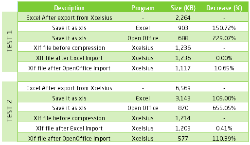
The main idea of this trick is to reduce the size of the xlf file using OpenOffice software. Let me start by showing you the test results:

For the purpose of this test, we created an Xcelsius file called TestCompression.xlf

First we exported the xls file from the Xcelsius file by selecting Data -> Export:

We then saved the xls file. As you can see in the screenshot below, this generated a 2,264 KB xls file, so our objective was to decrease this file size.

Next we opened the xls file with Microsoft Excel and without modifying anything we saved it using another name. We repeated the same steps but this time with OpenOffice. In the image below you can see the decrease in size of the xls file. The size difference between the original xls file and the OpenOffice xls file is quite significant.

Finally we imported the new xls file into Xcelsius by selecting Data -> Import

In the screenshot below you can see that we decreased the xlf file size using the OpenOffice xls, but the change wasn’t very significant. TestCompression-OpenOffice.xlf is 1,117 KB, compared to the original TestCompression.xlf which was 1,236 KB.

As a result, we decided to test with another xlf file, which included hard coded data, to see if the compression would be more significant. For the second test, we achieved the following results after completing the same steps as outlined above.

In this screenshot we can see a significant decrease in the file size of the OpenOffice xlf with hard coded data. The original file TestCompression2.xlf file was 1,241 KB and the final TestCompression2-OpenOffice.xlf file was less than half the size (577 KB).

As a result of these two tests, we observed the following:

  • Each time we modify an Excel Sheet inside Xcelsius, the size of the xls file increases.
  • When the original xls is very large, the decrease in size is more substantial when we use OpenOffice.
  • If we have hard coded data in the Excel file, we notice a greater size decrease than if we have QaaWs (Query as a Web Service) or Live Office Connections in the Excel sheet.

From now on, each time we attempt to generate a swf and we have made modifications (to data or Excel formulas) inside the Xcelsius Excel Sheet, we follow these best practice steps:

  1. Export from Xcelisus to xls file
  2. Open xls with OpenOffice
  3. Save it as xls file with new name
  4. Import to Xcelsius

In terms of speed, we notice changes in the swf loading process especially if most of our data is hard coded.

Finally find below a summary of the results obtained:


If you have experienced a similar situation with your Xcelsius files, I would be interested to hear how you have managed to reduce the file size. Also if you have any suggestions or feedback about my methods in this post, feel free to leave a comment below.

Real Time Dashboards – Lessons Learned

There are some scenarios in which a fast pace is required for data monitoring. This is where real time dashboards come in. A real time dashboard can display information with a high degree of frequency. This information is used by the audience to make quick decisions to correct the behavior of certain foreseeable trends. Real time dashboards can also set off alerts based on business thresholds allowing the audience to react quickly based on up-to-the-minute information.

Real time business intelligence is relevant to multiple industries and departments. Dashboards can be used to monitor call centre performance, IT system usage, data security, dynamic pricing, and inventory optimization and even support fraud detection and risk management efforts. Based on our experience building a real time dashboard to monitor call center data, this article will highlight tips and lessons learned for anyone who is undertaking a similar project.

ETL

Scheduling Frequency In reality the dashboard is not real time. It is a batch job with a very short refresh/update frequency. In our case it was 1 minute, which is also a limitation on Data Services batch jobs. It is important to know these limitations and also to know how fast your entire ETL batch job can run.

If batch job total duration > batch job run frequency then you will create overlapping processes which can immediately cause two issues:

  1. Overload your server or generate refresh slow downs

  2. Create inconsistencies in your data if your ETL does not correctly do blocks and queues write process to DB tables.

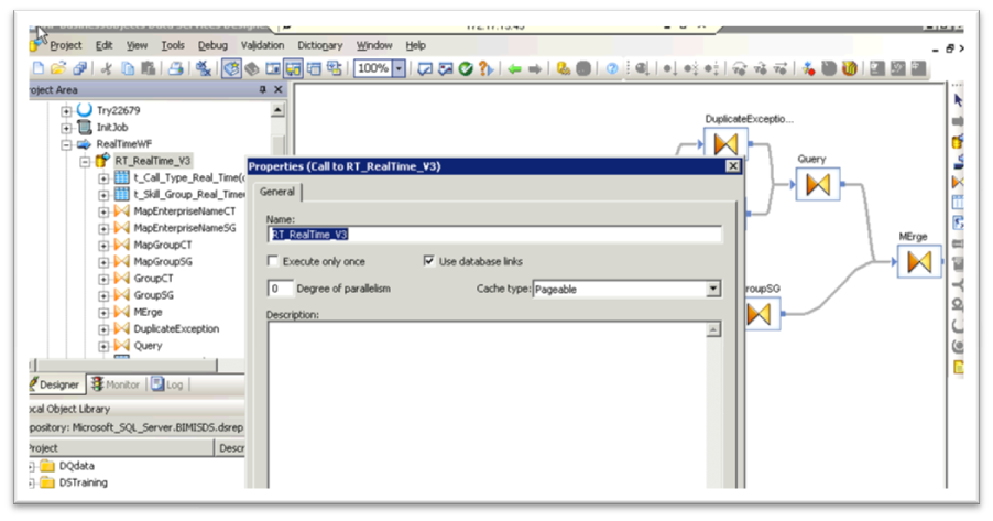
Run Optimization Given the need presented above: batch job total duration < batch job run frequency, you must search for the optimal setting to run your batch job. In Data Services there are some situations that can easily speed up your job execution but there is a delicate balance you must consider. One example is the memory method it uses to run the batch job, which can be selected from:

  • Pageable

  • In Memory

Pageable

Also whenever you have a table comparison process, the performance can be optimized by running the comparison as a separate process.

Table comparison

The In method runs faster when your server has enough RAM resources, however if your server does not have enough free RAM it will overload and will not be able to catch up with new spawning processes, running lower and lower in physical memory until it causes a complete  server crash.

Tomcat

Memory management Tomcat, under determined circumstances, does not perform well with memory management and garbage collection. When executing several QAAWS every minute the memory it uses can build up very quickly. Any Tomcat service on a 32bit Windows environment will have a limitation of 1.2 GB of memory to allocate. Tomcat becomes unstable when it reaches that limit and new requests are still coming in at a constant rate.

There are several tweaks on Tomcat and JVM memory  that can be done to optimize this.

One example of these tweaks is the memory limits that can be set when Tomcat is started; these can be set using windows registry or run time modificators.

Cache Optim flag The QAAWS application that comes bundled with Business Objects has a limitation set to cache data requests. When the same request is done in short periods of time the cache data is sent instead of running the query again. To avoid this and get new data every time, you need to disable this functionality on the dsws application properties:

dswsproperties

To disable it, you need to set the qaaws.cache_dpresult.optim flag to false.

qaaws cache

Restart Script In order to keep Tomcat service from memory overloads it is a good practice to schedule an overnight restart that will force garbage collection. The script can be very basic or contain additional cleanup tasks.

Script

HTML Container Placing the flash file on  html container will allow you to execute some actions prior and during the flash file execution. You can run javascripts, pass mandatory flash variables (i.e. suppressing tomcat error messages when running qaaws), etc.

The most basic html container for an xcelsius flash file will look as follows:

Xcelsius flash container

Auto refresh Java script As mentioned before, an HTML container will allow you to run javascript programs on the Explorer window executing your xcelsius flash file. Many applications can be given to javascript but one of them could be the browser page auto-refresh function. With the refresh you can wipe out outdated errors from screen.

No Error flash Variable The no error flash variable is a new functionality on Xcelisus SP4. It allows you to set the pop-up error windows off in cases where the error is not directly related to Xcelsius logic, i.e. Tomcat outages, scheduled system restarts, etc.

To add this functionality to any Xcelsius dashboard you need to add the flash variable input to your xlf file first.

Flash Variables

Finally you also you need to pass the variable to the SWF as indicated in the HTML container code example above.

I hope these lessons learned are helpful to anyone working on a real time dashboard. Feel free to leave a comment or question below if you need more information on any of the tips provided in this post.

SAP Xcelsius Challenge for Community Poll Results – Best Practices

I entered the SAP Xcelsius Challenge for Community Poll Results to flex my Xcelsius skills and also offer some fresh options for dashboarding to the SAP SDN community. I’m pleased to report that my submission received an honorable mention in the competition. Thanks to everyone who voted!

In this post I will explain the tools, goals, content and structure that I decided to work with for this challenge and my best-practice steps for developing an Xcelsius dashboard.

1. Tool selection

I started by defining the high level goal, and selecting the tool that fits the best. SAP Crystal Dashboard Design (formerly known as Xcelsius) is a great tool and platform – obviously for dashboarding – but it’s not for all purposes. SAP BusinessObjects offers a wide range of tools that can  solve specific scenarios; these are well integrated and often a combination of two or more is the best solution.

2. Purpose & Detailed Goals

Why am I building a dashboard? What insight am I interested in?

Besides displaying the poll results, my goal was to allow performance analysis of continents, regions and countries participating in the Winter Olympics, with a focus on the games in Vancouver.

In my opinion, to ask and answer the above questions is very important and often overlooked in favour of defining KPIs first. Without setting a clear goal, I wouldn’t have been able to decide which KPI was more or less useful than any others. With that defined I proceeded to answer the next questions.

3.  Content

How can I achieve the above goal? What are the best performance indicators? How can I display these KPIs?

Possible KPIs

  • Number of medals

  • Number of gold medals

  • Weighted number of medals (gold * 3 + silver * 2 + bronze)

  • Number of medals / population

  • Number of medals won by country / Total number of medals

Possible display options for KPIs

  • Trends – Which indicator’s trend would be best to see?

  • Comparisons – What would be the dimensions to compare? 

I chose the most common KPI: Number of medals. But as you will see, this single KPI can be displayed in a number of ways. A less traditional way – in terms of the Olympics – is grouping by geographical dimension. This gives a unique view, not to mention that it allows me to showcase my DrillChart add-on.

4. Structure

How can I best organize my content? 

At this point, I decided to summarize what information I had and try to find a place for my content on the screen:

  • The mandatory poll results – vertical bar chart.

  • Number of medals by region – horizontal bar chart

The Poll chart has all the sports listed, so it gives an opportunity to use it as a selector too. I thought it would be good to connect these two charts and allow the user to analyze the number of medals by sports as well. Although it might not be as clear as a horizontal navigation bar spanning the header of the dashboard, I opted to use it – with clear caption –  to save some screen real estate.

The order of selection would be: Sport → Region, so I put the Poll Results to the top left side, where the viewer generally starts scanning the screen. I used the two colors of the Vancouver games – green and blue – to make a clear distinction between the poll and the medal analysis.

Olympics Dashboard 1

The two main charts consume about half of the screen, and I still had a lot to show:

  • Trend lines

  • Distribution of medals – Gold, Silver, Bronze

  • Historical aggregations

  • Comparison to the previous game

All the above information is dependent on the user selections (Sport – Continent / Region) and gives more insight into the data. I used micro-charts under the main medal chart to show the details.

Olympics Dashboard 2

5. Implementation

The final part is the actual development. Luckily this is straightforward – and much faster – when the functional and layout design are well defined, although this is always an iterative process with some modifications.  

I was happy to practice a little bit on this example, and would be happy to hear your feedback! And if you are looking for some creative dashboarding expertise, Clariba has a wealth of experience and very talented consultants in this area. Feel free to contact us at info@clariba.com.