The launch of the new on-premise BI version 4.3 represents the beginning of a new era in which users can expect a consistent HTML5 experience across different SAP tools and mobile devices.
It takes just a few minutes of use to fall in love with the new interface, but this is not merely a facelift. Instead, it feels as if SAP has really listened to its users and usability experts and has produced a meaningful and much-needed set of improvements that will redefine how the tool is used.
First thoughts
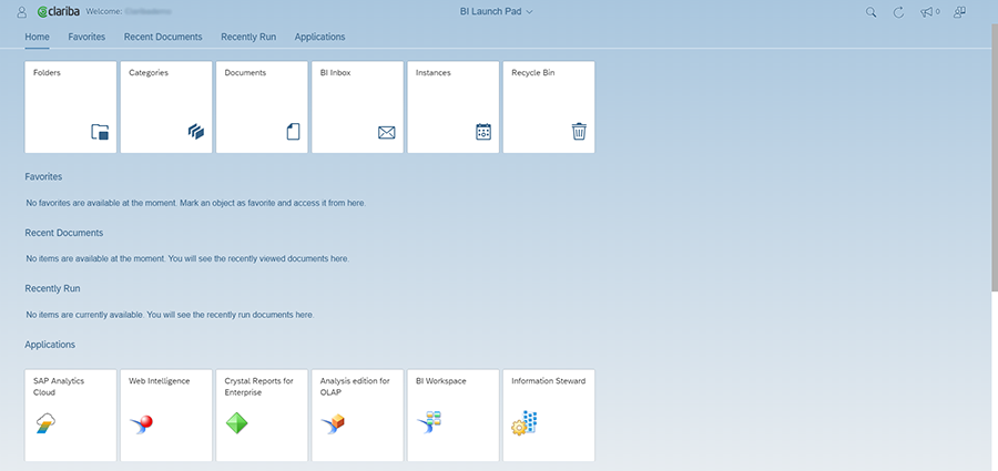
The landing page looks very similar to the previous FIORI (4.2), but once you scratch the surface, there are a couple of significant differences:
Key content has been regrouped and is now accessible from tiles.
New Application tiles allow you to create native HTML5 documents from scratch.
The layout has changed slightly, in terms of the document/list format. However, if you miss the old appearance, it can easily be simulated by setting your browser zoom level to around two-thirds (67%).
A few highlights
For those with their minds set on the old JAVA 4.2. launchpad, these are:
The Documents tile provides a clear list of visible documents relevant to the user. Administrators can see all documents and sort by type, as in the Central Management Console (CMC) Objects list. Very handy for a quick audit!
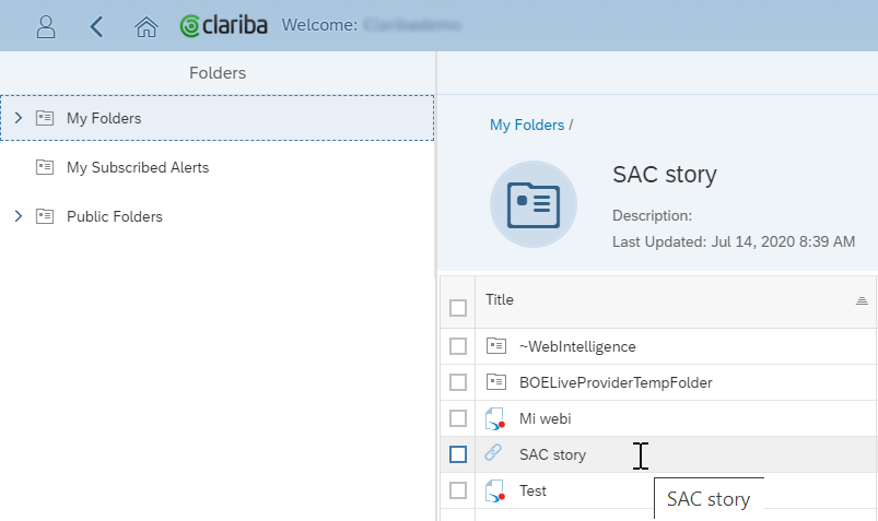
The Folders area shows the most relevant content with access to My Folders and Public Folders.
The Instances section is similar to the CMC Instance Manager, with an integrated search engine giving the user full functionality. This includes options previously only available for administrators.
“Favourites” is essentially a tag, while “My folders” is each users’ private storage area.
A handy feature is the “Currently Open Documents” dropdown list at the top of the screen, which is always available to navigate quickly between open documents.
Opening a document takes one click (not two as before), for parity with mobile devices, and a faster user experience.
When uploading documents, you can allow them to replace earlier versions.
Some enhancements vs. the FIORI 4.2. launchpad are:
Publications: These can now be created and managed from the user interface.
Scheduling: You can now select multiple destinations, and match business hours.
Customization
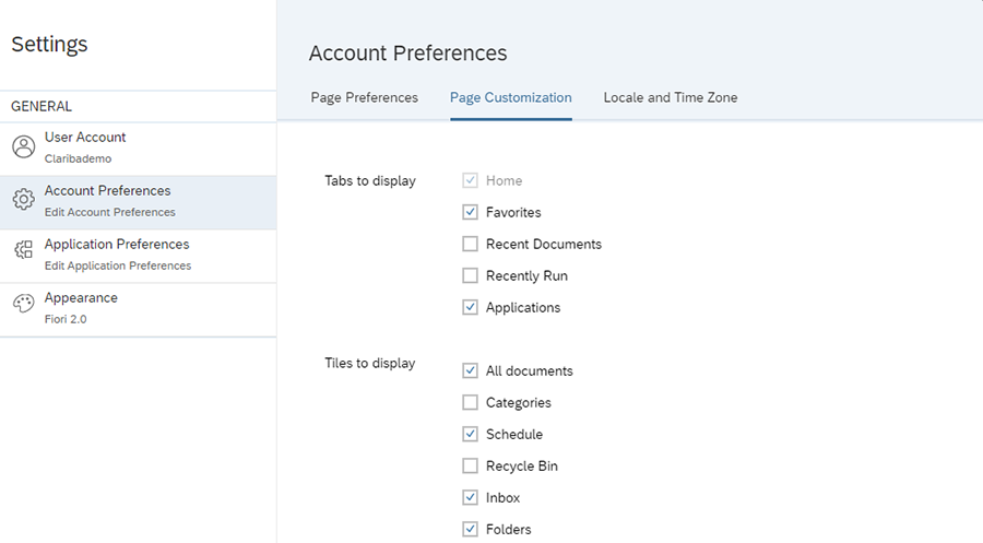
While the “View All” buttons provide convenient lists, you generally won’t want to see areas like the Recently Run Documents or tabs like the Recycle Bin.
There are three customization levels to allow you to choose what you see:
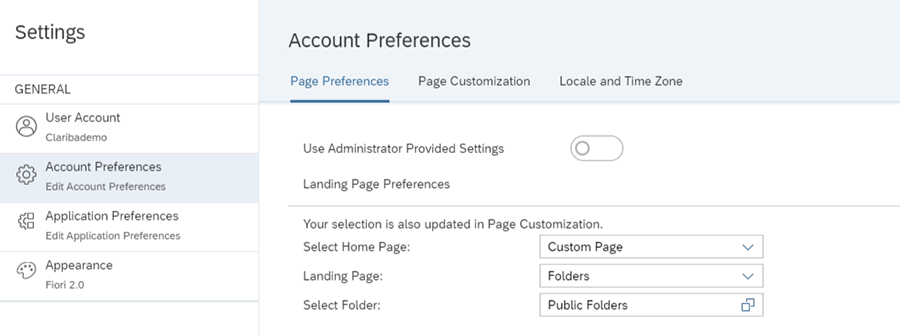
Choose landing page: e.g., selecting “Public Folders” as your initial page.
Hide tabs and tiles: you can hide undesired content, individually or using group security features from the CMC!
Custom Themes format: you can bring the CSS to our graphic designer to have a launchpad compliant with your corporate marketing guidelines. The new Theme Designer assistant makes it easier to create your own look.
Hybrid Experience
Although everything in this portal may seem to be content-centric, you can quickly access SAP Analytics Cloud (SAC) from the BI 43 Application tab. When this is configured, the transition to SAP Analytics Cloud is transparent for the user.
Users can create SAP Analytics Cloud models and stories using the Platform universes, provided they have LDC installed.
Hyperlinks now support HTTPS, so you can have a URL that opens a SAP Analytics Cloud story from the on-premise launchpad.
WebI interface
At first, creating a new document might feel strange, as buttons and items are placed in different locations. However, it only takes a few minutes to discover how everything works. The most novel aspects are:
Input controls appear now at the top, horizontally, in the shape of hideable dropdowns, which respects the full previous functionality.
Tabs are now at the top.
Objects are now on the right-hand side and need to be dragged and dropped at the left. The rationale behind this is alignment with the cloud environment and better usability with mobile devices.
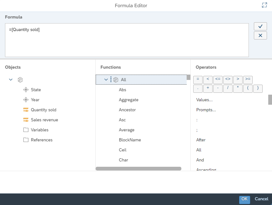
After navigating a little, we realized the power of the right-click, which can perform nearly every action. We also enjoyed the significant amount of space to work in and the very Excel-like formula editor, which resembles the previous versions with even more additions.
A future replacement of SAP BusinessObjects WebIntelligence (WebI) by SAP Analytics Cloud does not seem set to happen in the short term. After playing with the new WebI, you soon realize that it is not missing any key features. The new version offers the professional and complete Query & Analysis engine with an even better look, feel, and user experience, written in a language fully adapted to mobile and cloud use, and including data discovery and dashboarding capabilities.
Roadmap
We could not find a way to get rid of the Web Assistant once opened or to minimize it by clicking out. Also, in any folder or document list, at two clicks the Applications WebI area appears too far away. These are small improvements to these areas that could be considered in the roadmap for future versions.
Conclusion
FIORI 4.3. is a fast and professional front-end where usability has been taken seriously. It will please both users from the old 4.2. Java school and those recent adopters of FIORI 4.2. who were frustrated by the lack of usability. The customization possibilities will also please users of this new portal. We would predict that version 4.3. early adopters will enjoy the new functionality and the adjusted corporate look and feel for their deployments.


